Want to make your main interior office sign look better?
This non-glare interior office sign looks better, and is easy to read.
Let’s face it, your interior office sign is what a visitor sees right away, when they are entering your place of business.
And this sign is reassuring them that they are in the right office space or location.
Because your main interior office sign is normally located behind a receptionist area, check-in counter or even a waiting room.
And maybe, if your like us, it gets a little confusing at times if the sign is hard to see, read or notice.
Meaning, have you ever found yourself wondering whether you’re in the correct location, line or office?
Can you imagine walking into a waiting room or standing in line, then finding out you’re not in the right line or worse, you’re in the wrong office suite?
Wouldn’t it be nice if you knew instantly that you were in the right place?
Sure, if you have an entry area or even a smaller office space which greets, and handles all your visitors, from a single receptionist area, then all is good.
However imagine if your opening up a new medical clinic, grocery store or even an automotive dealership, then what?
Sure, your main exterior signage will let visitors, patients or customers know that this is your location. But what happens when you have multiple departments or divisions within your main facility or office?
What if there is one-line for signing or checking-in? And another for checking-out or picking-up? And the list goes on.
But let’s say you want to make it easier on your visitors. And you want to reassure them that they are in the right place or line or division.
The Best Solution Is To Have An Easy To Read Interior Sign
What would be the best solution?
Well, one solution would be to make sure your main interior office signs are easy to see, read and understand.
Sure, you can choose to go all out, and leave no doubt, by doing a reverse lit graphic or raised lettering or even a stud mounted back lit logo on your main receptionist wall…
After all, the ideas are endless. However let’s assume you want to keep it simple.
And you decide to go with a flat panel type of sign. One that looks good and is easy to read.
What type of substrate will you choose for your flat panel sign? Sure, you can have a lot of choices here, but why not keep it simple.
For example, how about if you narrow down your choices to a non-glare substrate verses a glaring one? So let’s toss out all the glaring types of panel options. (Those types of panels that reflect light and have a sheen to them.)
Why? Because they can be harder to see and read.
Choose A Non-Glare Sign Substrate
And what if you choose a nice non-glare PVC plastic or even a brushed aluminum substrate, that also cuts down on a lot of glare.
Then you decide to go with a nice 1/4″ thick and rigid material option that your sign expert presented. Because this can give you a nice raised look, if you’re planning on mounting it directly to a wall. Or you ask for stand-offs? So you can raise the sign further off the wall.
But if you want to keep it simple, and easy to clean, then the best idea would be to consider a nice PVC sign.
Plus flat PVC plastic substrates come with the option for slightly pebbled surface areas. And this adds to the your signs overall appearance.
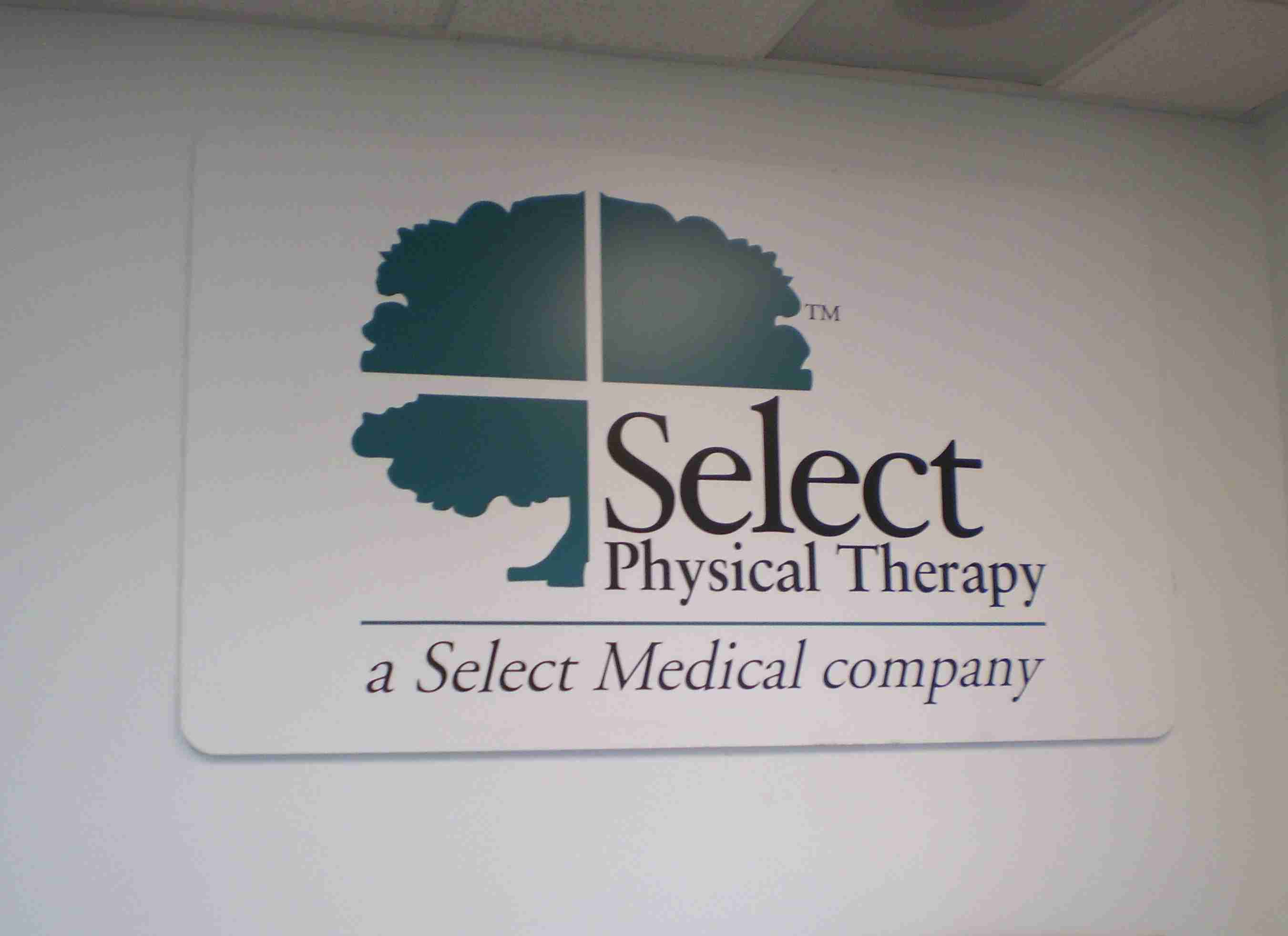
And as you may see, from the photo above, that’s a nice and clean, professional looking, and easy to read, interior office sign.
Plus another benefit is, these types of signs can be matched to Pantone color call-outs. And easily flat bed printed to your specifications (approved design.)
Which means, if you want to maintain color consistency of your brand, from office to office, and or location to location, you can.
But the best part is, these types of flat panel office signs are non-glare, and that’s what matters most.
So if you’re looking for some simple sign ideas for your main interior office sign then contact Signs West Outdoor of Las Vegas today.
Now, this doesn’t mean we can’t help you with lavish looking or illuminated receptionist area signs…
It means, if you want a simple and easy to read, non-glare type of lobby, aisle, department or division sign, we got you covered.
We simply look forward to helping you get a better looking interior office sign, today.
If you have a comment? Leave one below. Enjoy.
Until next Months release, may your visitors feel at home, instantly.
