If you want an easy to read sign then you want to use the Helvetica type style font.
Hi, Larry here with Signs West Outdoor of Las Vegas with this Months helpful news release.
This Month we want to point out the importance of choosing a proper font or type style for your:
- Sign Text
- Signage Copy
- Wording on your Sign
- The Sign message you want to get across.
Why? Simple. View the photos on this release then think about why these signs stand out in your mind.
(Remember, these Signs serve a purpose of getting your intended message out to your audience as quick as possible.)
So what came to mind? What did you notice?
If your like most people, you knew almost instantly what the Sign message was.
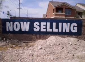
For example, the ” Now Selling ” large wall banner is easy to read and it probably took you less then a second to understand the meaning or message behind the signs purpose. Right?
The reason the large wall banner in the photo above was so easy to understand is because of the type style.
The type style is a nice clean Helvetica type font.
It’s a simple font and has no distracting San Serifs or lines.
Plus the simple white text in Helvetica was placed on a nice dark back ground for quick easy contrast.
Helvetica bold was used to power home the message and do it fast.
Why? Think about it. This developer is selling homes.
Vehicles are traveling by this new housing development in excess of 45 MPH.
If some one were to get all fancy and use multiple colors, San Serif lettering and multiple lines of copy then it would not be read, noticed or understood as quickly as it is now.
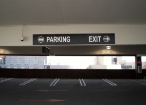
The same holds true for the Parking Garage Directional sign and signage photo here.
I mean, think about it. When your driving into a parking garage you need to ” get the message ” almost immediately.
Again, notice how a condensed version of the Helvetica type style font is utilized on the directional sign.
You see how fast your mind understood the message here?
The directional arrows on this sign were placed inside circles to break up the meaning of the sign, so one would understand it quickly.
Now, can you imagine if someone wanted to get all fancy with parking garage signage and started adding logo’s and multiple lines of text?
I’m sure there would be numerous accidents as vehicles slowed down because the drivers were trying to read or understand the sign.
Heck what if someone decided to back up?
Don’t laugh, because there are people that would do just that.
Thus, the main point here is to consider all the different type styles and fonts available for sign text and copy.
Every type of sign has a certain type of purpose. A purpose to get a message out or attract attention.
For attracting drivers that are moving along hi-ways or roadways then you want to use a clean easy to read type style like Helvetica.
Do you see how each type of sign has a purpose?
So next time you want to get your sign text, copy or message out and you want your target audience to see it and understand it, then think about using a Helvetica type style font.
Once you choose the copy or text and you know the signs intended purpose then adding a nice contrasting color to the sign letters or the sign background you will be maximizing the signs visibility.
Doing this will ensure you get your message out and it will be seen.
Because being seen is what it’s all about. Right?
If you are looking for sign ideas or not sure what you should do then let us know.
We will be happy to provide different sign layouts using different fonts based upon your signs intended end use.
If you don’t know your signs best purpose, then ask your local or national sign company for help or contact Signs West Outdoor of Las Vegas today.
We like to use a combination of the Helvetica type styles because they are so easy to read.
When a sign is easy to read then it definitely gets the intended message across to your customer or visitor.
May this be useful insight into understanding why choosing a particular font or type style is so important.
Until next Month.
May all your signage and signs be readable.


