Want to know an amazing secret to attract more renters and home buyers to your development?
Hi Larry, here.
This Month release is for you if:
- You want to attract more renters to your apartment community
- You want to get more active Home Buyers to visit your new development
- You want better faster results right now
When you think about it, leasing up quickly or wanting to sell new homes faster is not rocket science.
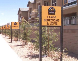
Take a gander at these multi-family amenity signs in this post photo.
What do you see?
Did you notice the consistent branding? or the near perfect alignment?
How about the easy to read text?
This is just one example from the vault we want to share.
Why? Think about the old adage of how making a positive first impression makes a big difference.
Do you see how these nice, clean and easy to read amenity signs present positive first impression?
Now imagine if all your community signs and signage were branded in a similar fashion?
What if the main 10×20 or onsite 8×16’s looked this good?
What if they stood this straight?
What if all your single and multi-family development signage looked this good?
You see the point.
Many times, you will drive around the Las Vegas valley and bare witness to:
- Leaning
- Fading
- Poorly laid out
- Hard to read
- Cheap looking
- Lack of brand consistency
- Disturbing and down right ugly signs
Go ahead, take a drive around.
Now imagine your the potential renter or home buyer?
You see what they see?
The bottom line is, you want your continuity and master plan development signage to attract buyers and renters.
You do not want to scare them away, do you?
Well, if you want to make a splash and you want to suck in customers like a turbo charged hoover then isn’t it time you cleaned up your appearance?
If you want to look good and make a positive first impression then Signs West Outdoor is a good place to start.
We will ensure your onsite and community signs reflect your brand.
We will ensure your signs attract and do not distract.
We will help you lease up faster or sell out quicker.
How? We don’t just lay out text on a board or mix content together.
We will design and produce consistent attractive theme signage for your entire development.
From your main entryway signs all the way down to your pool rules signage.
It will all fit the eye just right and creates a positive first impression.
It’s your choice.
Keep looking for same ole, same ole cheap signs and continue scare the beegeevers out of renters and buyers or contact the pros at Signs West Outdoor today.
It really is that easy!
Consistent, elegant and appealing signage is an amazing secret to attracting more renters and home buyers today.
Until next month. May they come in droves!
Please leave a comment below if you know of other Sign Co’s who know how to make a client look amazing.


