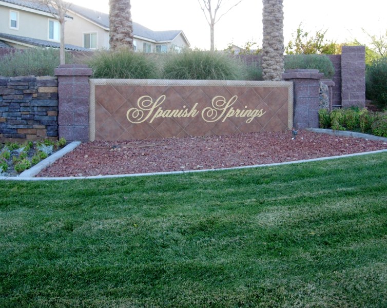
Why not add a touch of elegance to your community with inlaid stone entry way signs too?
If you are driving around town you may quickly notice some entry way community ID signs while not seeing the others?
Why?
Because most entry way signs are produced using typical aluminum metal framing with stucco finish and some stud mounted letters
Some are even produced using glazed porcelain tile with a sandblasted in community name
And these type of typical signs are so common they tend to blend right into their surroundings
But few are as elegant as the entry way ID sign you see in the above photo on this release…
Which begs the question, do you think you would experience a sense of “wow, that’s a really nice looking sign” if you saw this entry way ID sign depicted above?
Would you notice the offset inlaid stone on this entrance ID sign?
And if so why?
Is it because this entry way community ID sign is installed up higher on a knoll so the signs visibility is maximized?
Or did the the elegantly inlaid angle pattern of stone face with inset gold lettering do the trick?
Maybe it was both?
At the same time, would you think this sign is representative of an upscale community?
After all, sure does look good, don’t you think?