
Can New, High Contrasting, Building Number ID Signs Decrease Confusion And Ease Traffic Flow Within A Multi-family Community?
Have you ever visited a multi-family community and gotten confused or even lost… while looking for your friends’ residence?
Where you wheel into the main entrance –while following the directions you were given to turn in, take your second left, go straight, around the curve, turn right at the 3rd cross walk, and it’s the 4th building on the left, building number 8.
And your instructions go on to explain… park on the North side, walk around back, go up to the second floor, and go down to the 3rd door on the right?
And You Get Lost …You Missed A Turn…
You Couldn’t Spot The Building ID Numbers?
And you get lost? Somehow you may have missed a turn? Or maybe you didn’t see the cross walks or you couldn’t spot the building ID numbers? So you double back to the main entry to take a look at the community ID directory map?
And you see there’s 37 distinct buildings. So you begin to trace your best route, through the community, to arrive at building number 8. And suddenly, you realize, you may have went too far past the curve after your second left? “Ahhhhhhhh.”
Traffic Begins Backing Up… Horns Start To Honk!
But as you’re going “ahhhhhhhh” and trying to eliminate the confusion and locate your best route to building number 8… traffic begins backing-up behind you. Horns start to honk. So you start to wave the traffic to go around you… And as you do, you lose you train of thought.
Does this sound familiar? Who hasn’t been there? Especially now-ah-days with all these newfangled, circular, round about, yield types of turns… which spin us off course often and rather easily.
Heck, even with GPS –anyone could get lost while searching for a particular building number inside a sprawling multi-family community.
And not only you… can you imagine what pizza and delivery drivers must go through every day?
Wouldn’t It Be Nice If Communities Made It Easier
To Spot Building Numbers?
Wouldn’t it be nice if these communities just made it easier for you to spot the building number you’re looking for?
What if these multi-family apartment communities added building number directional signs throughout the community? Or better yet, what if they made use of high contrasting building unit number ID signs?
Wouldn’t it be easier to spot the building number you’re looking for? After-all, many older communities retro-fit all their onsite property ID signage every 10 years or so…
Plus, back when many of these communities were first developed, they added landscaping. But over time the landscaping and trees grew out. And as they grew out, they cast shadows on the unit ID numbers or blocked them from view –all together.
Why Not Retro-fit Or Sign New A Community With
New High Contrasting Building ID Signs?
So why not simply retro-fit or sign a new community with high contrasting building ID signs?
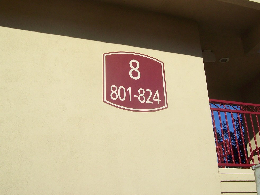
Take a gander at the photo above. Do you see how this building number 8 sign with its unit range numbers pops, and stands out? See how easy it is to read and understand?
At the same time… notice how the high contrasting colors hue nicely with the overall communities’ theme colors.
Notice how the rich burgundy background color pulls off the burgundy railings and stairway accent colors.
And notice how the building number, in the photo above, quickly soars off the sign face and can be seen instantly without any effort. Or looking around. Or confusion?
Plus, the building and unit numbers hue with the actual building color as they fly off the face, because they are designed inside a high contrasting burgundy background color. And by adding a slight curve cut to the top and bottom of the sign, even a boarder, adds to the overall appeal and flare of the sign.
Yet, this unit number sign is rather simple. Nothing fancy. No confusion needed.
Modern Sign Tech
Makes Building Number Signs Easy To Produce
And with modern sign manufacturing tech, now-ah-days, building number signs can be UV flatbed printed on long lasting aluminum panels and CNC routed to produce custom shapes and designs.
Not long ago, signs like this would need to be screen printed then, cut out, and then clear coated to protect them from fading fast in the sunlight. Or vinyl lettering was used. This was time consuming and tedious work. And costly.
Plus extra screen print ink was required to be stored to protect the integrity of the colors being used in case a sign needed to be replaced or added down the road.
Now? Simply program a Pantone PMS coated color into a flatbed printer, insert the aluminum sheets, and presto –all the signage is consistent.
Which means, the overall theme colors of the community remain intact and the contrast is consistent.
So, ask yourself, wouldn’t you like to pull into a multi-family sprawling community and see a building number sign like in the photo above?
Would this not make your life easier? Wouldn’t you be able to spot the building numbers much quicker, without any confusion? And wouldn’t it be nice if all retro-fit and new multi-family developments made use of new high contrasting building ID signs?
Signs West Outdoor Can Help You
With New High Contrasting Signage
Well… at Signs West Outdoor of Las Vegas, we may help you do just that.
We may help you with retro-fit all your community signage. And we may design new high contrasting signage which is more visible and easier to see.
We may even help you pick out the best contrast color to use by tying it into your communities theme color(s). This way, your signage is aesthetically pleasing too.
So if you want to decrease confusion and increase traffic flow inside your new or existing multi-family community, then contact Signs West Outdoor today.
Until next Month’s release…
Have a great 4th of July Weekend… and may your pizza orders arrive much sooner! (smile.)
