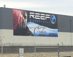
Did you know bigger or huge building banners will get noticed more often?
Hi all, Larry here with this Months useful Sign and Banner news direct from Las Vegas.
Were sure there are a lot of useful adages you probably have heard some where before when it comes to building signage and banners.
You may have hear that “a yellow back ground with red text is the number one color combo to utilize to attract the most attention”.
Or you probably heard “the use of fancy San Serif type styles on building signs is not as ideal as the use of more readable plain block text lettering like Helvetica”.
However when it comes to Building Banners here’s one you want to remember.
“Bigger huge banners just get noticed a lot more often then smaller banners“.
Take a gander at the photo over on the left in this release.
This is a large huge 60 foot wide x 20 foot tall banner on the side of a building.
Now if you think about it. That 60 foot by 20 foot banner sure doesn’t look all that big now once it’s actually installed on the side of the building. You see that?
That’s basically what happens. Big banners start to appear a lot smaller as you move further and further away from the building. (see photo again).
However, up close a 60 x 20 banner would be awe striking in size and once it goes up in the air and further back it sure does get small in a hurry. Wouldn’t you agree?
If you really think about it, did you know a typical billboard face is 48 foot wide x 14 foot tall?
Up close they appear massive in size however when driving along at 35 to 75 mph they sure don’t look all that big now do they?
Point is, if you want to been seen you want to go big with outdoor building banners.
Ever see the huge casino building face wraps and banners? There is a reason they are this big.
They want to be seen from the Interstate and from far away.
So it’s no different then when you want to advertise your business or brand on your building.
Whether you want to advertise a:
- Coming Soon
- Name of Business
- Now Leasing
- For Sale
- Now Open
- New Product
- Grand Opening
- Holiday Specials
You want to go big.
The bigger your banner the more readable it will be.
Well, it will be readable a long as you do not utilize to much text and pack a bunch of images on to it.
If you want to be seen more often then not only do you want to go big , you want to keep your message as simple as possible.
A good rule of thumb is 7 words or less with one or two photos max.
It’s no different then the same rules that billboard designers follow.
Again, keep in mind, when a vehicle is driving by they don’t have much time to read a bunch of lines of text.
Or when vehicles are backing up at a red light, a simple glance will do the trick if you have a nice clean and easy to read banner advertisement.
There are a lot of tricks of the trade so to speak when it comes to designing huge building banners.
A simple trick of the trade for a “Now Leasing” banner is to reverse out the words Now Leasing then allow for the Phone Number or Square Footage to be the opposite reversed out color combo.
Ideally speaking, you make half the banner with text being yellow on a red back ground and the other half being the phone number in red on a yellow background or visa verse.
The key is to break up your message so the human mind processes it faster.
These simple reverses will help break up the meaning.
If we assume you have a good attractive layout then the bigger you make the banner then the more it will get noticed.
Go ahead, take a look next time your out and about.
You may see some building building banners that make no sense because your brain can not figure out what’s on the gosh dang banner at the same time you will see easy to understand banners.
This will be a fun exercise for you as you will see exactly what ole Larry here is sharing.
You will then see that the bigger the outdoor banner is the more you noticed it.
If you want help to figure out the proper size that will be readable on your building, then contact Signs West Outdoor today.
Ole Larry here will be happy to help or you may talk to one of our banner designers for expert advice.
Until next Month let’s hope you didn’t opt for a small banner to save money because what good is a building banner if no one sees it?
So, Go big, go huge and get a large building banner today and be rest assured you will get noticed.
Enjoy.


