Wondering How a Simple Sign Design Technique May Actually Increase Your Sales?
How simple white outlines on the Main Restaurant ID signage creates easy to read message.
By using this ‘simple sign design technique’ your business can immediately cut through all the clutter and ensure you get noticed.
If you ever want to stand out more among the crowded marquess, of you’re newly leased commercial center or mall location with ease, then this technique is for you.
Make sure your new store front or restaurant signs are easily readable, if not instantly.
And here’s why. Most store front or restaurant signage crowds the marquess of busy commercial centers and malls.
Traffic is pulling in or pulling out… parking spots are opening or filling fast.
The potential new customer is distracted… and in a hurry!
However, imagine, if for one split second, they spotted your easy to read restaurant or business sign then thought “I didn’t know (your business) has a location here?”
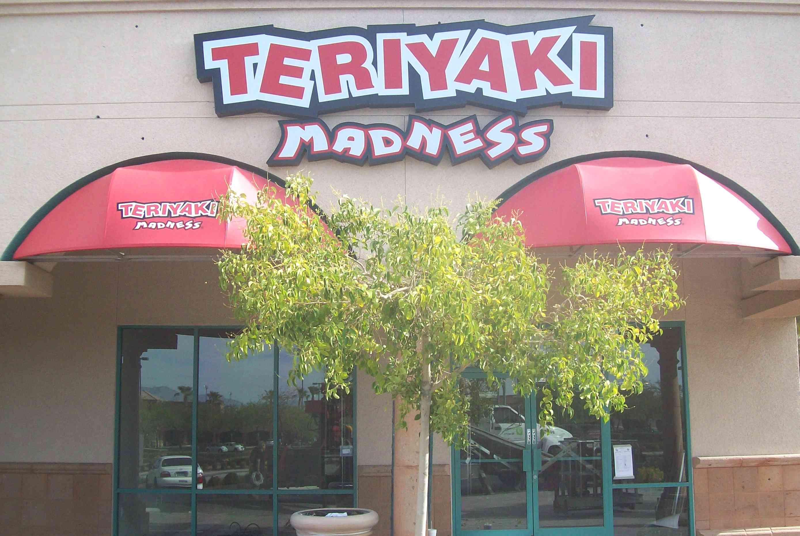
Take a look at the example in the photo above.
Did you know, by glancing quickly at the signage in the photo, one of your favorite restaurants suddenly became instantly ease for you to identify?
I’ll bet your mind didn’t even process, let alone, think about about “the white thick outline” or “the bright red lettering.”
Hi, ole Larry here with this Months release.
And after 30 plus years in the sign business, this Months release became a no brain-er.
Why? The other day, while stopped at a light, myself couldn’t believe my eyes.
Right outside of the truck window was a dumbo-jumbo of pan-channels letters (dark red) on a dark brown building marquee?
While thinking, “what a prime luscious corner location with full-frontal visibility to tons of traffic every day.”
Yet still… the shock set in immediately.
The lettering was like camo. It was hard to read and took some effort to process the name of this business.
However, this is a Company ole Larry here would visit, had this been known they have a location here?
And I drove by this commercial center everyday everyday.
Yet, being forced to struggle to figure out ‘what it is’ didn’t get my attention, up till now.
And there I sat, in my truck, thinking “Can you imagine how this Company would be able to super-charge their business by simply adding a thin white outline around the lettering or use white letter on the dark brown…?”
As the light turned green… my head shook with feelings of sorrow, for this Company.
Imagine if their prime spot marquee signage was easily readable and noticeable?
How does a business not see this? Is this not common sense? Did they get a deal on their signage?
Which leads to the main point for this Months release.
Each businesses, in effect, is competing for potential customer attention.
And when you fail to ‘stand-out’ more…
Your store or restaurant may be missing out on the pleasing enjoyment, of having more foot traffic strolling-in through your front doors.
Even if the potential customer is to busy to swing by today, they now know you exist, and where.
The point is, make sure your signage easily gets your message across.
You may find yourself surprised as business picks up when customers know you exist!
If you want to stand-out more or have a question, then give Signs West LV a call today.
Your success is our success.
Until next Month…
May your reservations be booked and lines at check-out be long!
