Ever wonder how simple restaurant vinyl graphics may enhance or add to an eateries theme?
Hi again, Ole Larry here with this months helpful release.
This month, we will present a simple way to add to a restaurants theme and appeal.
A simple way that will make a huge difference in terms of visuals.
A way to accentuate the mood, the setting, the atmosphere and most of all the visual appeal of your restaurant(s).
Shall we enlighten?
OK, OK, One simple way to enhance a restaurants theme is to make use of die cut vinyl graphics.
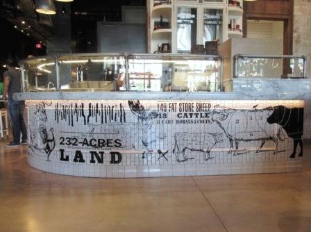
See the photo up top there?
That counter area looks pretty amazing, don’t you think?
By just looking at the amazing depictions and graphics on that counter, one would think a talented artist took about 2 weeks to produce those images, right?
Well, Guess again.
Did you know those cool theme graphics, depictions and drawings are simply die cut adhesive vinyl applied graphics to tiles.
Now before you say ” Get out of town ” or ” Stop pulling my leg there Larry “?
Want you to know, that those visuals and graphics in the photo above are simply die cut vinyl graphics.
That those die cut and plotted vinyl images were cut and weeded to produce the amazing images you see.
How? You may be asking? Well, you want to understand that Sign Business Technology has come a long way over the last 4 to 5 years.
New cutting, plotting and graphic scanning technology systems have entered the market which allow Sign Companies to make these cool looking theme visuals rather fast.
Heck in the old days, well about 7 to 8 years ago, this would have took a long time to produce.
Currently, with modern tech, these images, visuals and lettering may be simply programmed in and then die cut before one gets back from lunch.
Pretty amazing, right?
Look at how detailed the graphics are.
Look at the perfectly placed lines and text.
Look how it all tie together to allow the branding to stand out and bring this restaurants theme to life.
If you think about it. There really isn’t much you really can not do today to truly theme a new or existing restaurant.
heck, walk into just about any burger joint and see 4 to 5 foot tall mouth watering burgers that look real on the wall.
Stroll down the Las Vegas Strip and take a look at the theme restaurants everywhere you look.
From custom wall murals which place you on a beach in Venice to amazing tapestries which allow you to feel like your back in old Rome.
If you may think it, just about any type of restaurant theme may be brought to life.
So next time your looking for something really cool for your restaurants theme, ask about custom ideas from your architect or local sign company.
This example above was to show case how the most simplest form of die cut vinyl may turn an average counter into an amazing theme appearance.
A conversation piece, if I may.
A brand, an image an eatery to remember.
If you want help with restaurant theme graphics you may give ole Larry a call at Signs West Outdoor of Las Vegas today or check with your local Sign company of choice.
In the mean time, keep in mind, these graphics above in the photo are simple vinyl die cut graphics.
Imagine what you may do to theme your restaurant today.
Until next month.
May your restaurant theme graphics make ones mouth water way before the food hits their taste buds.


