Want to Know How To
Make Your Plain Jane Commercial Real Estate Development ID Wooden Sign
Much More Appealing?

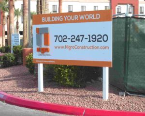
Does the raised 3D logo lettering on this wooden 4×8 sign face make you do a double-take? (By Signs West Outdoor of Las Vegas).
An easy way to make your wooden real estate – developer related, or onsite contractor sign more appealing is to simply make it more unique.
Because, the more unique your wooden sign is the more appealing it can be.
For example:
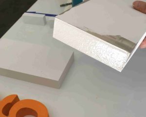
What if you begin by adding 1 or 1 ½ inch thick routed foam letters, even your logo, to your wooden sign face to give it a 3D look?
Would you not be one of the first to utilize this new unique and eye-catchy appeal?
As you may know, not many, if any are using 3D raised lettering on their smaller 4′ x 8′ or 8′ x 4′ wooden sign faces… Yet.
A Select Few
Enjoy This Appeal.
Is it because this is something new?

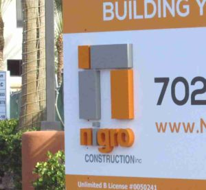
Imagine how the sun is constantly casting shadows off the raised 3D logo lettering on this close up view of a 4×8 onsite wooden sign. (By Signs West Outdoor of Las Vegas)
Being one of the first ever to add this appeal can explain why only a select few, as you can clearly see, in these example photos on this release are adding raised logo lettering to their smaller onsite wooden signs.
It’s something you just don’t see everyday… Do you?
Go ahead and take a gander at these photos… Would you not do a double take if you saw this wooden sign?
Can you imagine the constantly changing shadows that are being cast upon this wooden sign face throughout the day, by the sun? Is this not striking?
Would this not attract your attention? Due to its uniqueness?
How many other onsite commercial real estate developer wooden signs have you seen with this type of raised logo lettering? This may be your first.
Why Not Custom Color Match
with Pantone Mixed Paint?

Why not two coats primer and two coats latex enamel to ensure a longer useful life in harshest of climates. Plus a custom Pantone paint mix to match this Contractors company colors. (By Signs West Outdoor of Las Vegas)
And if you look closely, you may see, that these 1½ inch thick -CNC precision-routed foam logo letters are being custom color matched to order, with Pantone mixed paints.
All to the clients’ specified colors and delight.
Plus, if not for the two coats primer and two coats paint, what better a way would exist to add-in the extra protect for this amazing looking and visually appealing sign… In the harshest of climates.
Therefore, by being unique and being one of the first to start utilizing 3D graphics on a small wooden onsite sign face… Can one conclude that this sign and the Contractors name will not only be appealing, but memorable?
Would you even, reckon to guess that there maybe a few other sub contractors, on this job-site, wishing they too had such a mesmerizing notice?
Even Though a 20′ x 10′ Onsite Wooden Sign Attracts 5 x The Notice
A Smaller-Sign Can Mesmerize
As you are probably aware, a larger the onsite sign -like a 20’ x 10’, can attract 5 times the attention of a smaller 8’ x 4’ or 4’ x 8’ sign… However, by simply adding raised lettering to compensate for the smaller 4′ x 8′ or 8’ x 4’ sign size… is it not certain that this small sign can get a double take, if not more, and even be mesmerizing?
What’s interesting to consider is… does this attractive, clean and unique looking sign also reflect on this company’s style?
If you are an owner or a big-time expanding hotel chain and you’re looking to build a new commercial development… Would you not invite this contractor to bid? Does this sign reflect the contractors’ ability to focus in on the details? To be unique?
In Sum
Being Unique and One of The First
Can Be a Huge Advantage
All in all, the bottom line can be summed up as follows… Being unique, creative and the first can have a positive effect on your business.
Yet, the irony of this tale is that the client is the one whom asked for their logo and lettering to be raised. And, they were willing to pay extra. So, we wish to thank the client for opening our eyes to this unique and appealing way of having a stellar looking sign -that gets noticed.
Who would have ever thought of adding raised lettering or a logo to a smaller 4’ x 8’ or 8′ x 4′ new development onsite wooden Contractor (on the job) ID sign?
We sure didn’t. But now we do. And you do too. Even after 32 long loving years in the Sign business, you can say, we learn something new every day.
So, if you’re looking to be more appealing than visit Signs West of Las Vegas today by tapping here. Or call us at (702) 879-8250 right now.
Until next month, may you raise-up and stand out, with more appeal.
Plus, we would love to hear what you think. Leave a comment below… As time permits.

