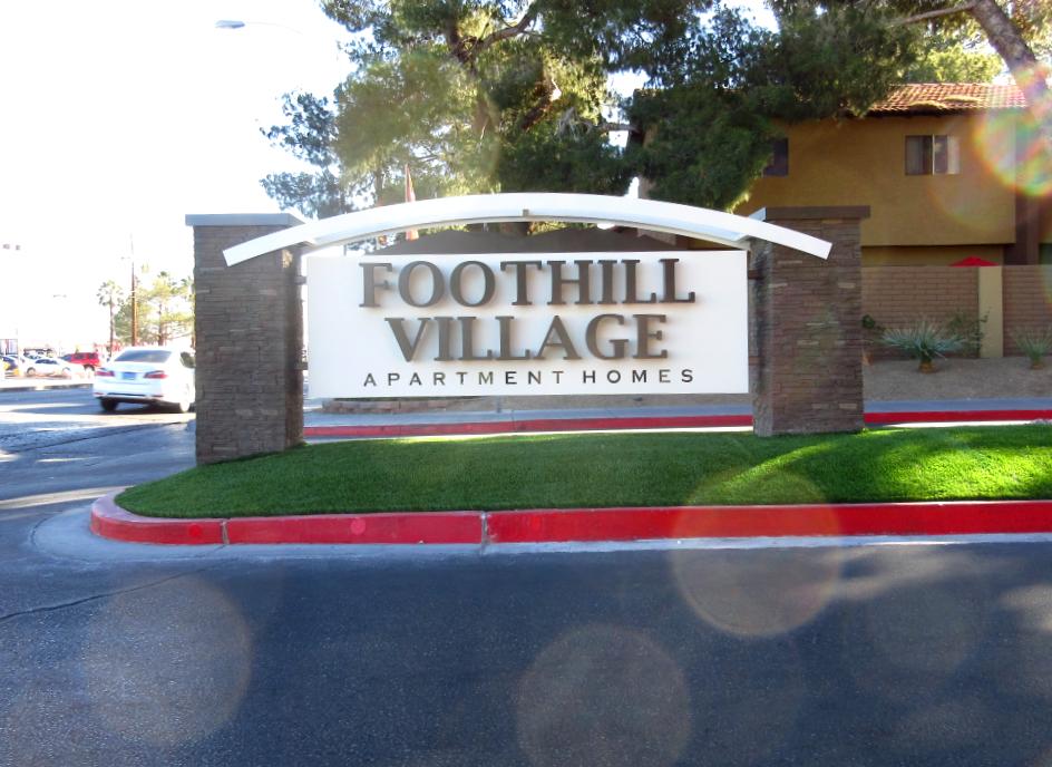
Would you agree this new double sided entry way monument ID sign for this apartment community is attracting attention?
And if so, why?
Could it be because this new entry way sign has a nice clean design.
A design which is easy to comprehend.
Which means… let’s say you’re out and about and you’re looking for an apartment to rent.
And as you’re cruising along you suddenly spot this apartment communities main entry way ID sign (depicted in the photo above.)
How could you not see it, right?
After all, the entry way sign is constructed with the use of some nice and clean looking end cap brick column supports.
End cap columns which support the wide open (unobstructed) visual face area.
An area which allows for easy readability.
Then add-in the simple font style of the raised stud mounted aluminum letters which spell out the community name on a contrasting background and readability becomes near instant.
Thus a free-standing entry way monument ID sign which stands out for all to see.
You may then ask yourself, how would you not see the “Foothill Village” community name on this sign even if you were driving by at 45 mph.
Not only that, doesn’t the curving cutout “flare” section, which highlights the top of the sign, add the finishing touch to catching your attention?
After all, the accentuating “flare” graphic design section on the top of this monument ID sign is truly hard to miss.
Yet, when you add in the contrasting mix of this signs light creamy background color and flare with the dark brown bricks and lettering it just “pops.”
And, as you may agree, this new style of entry way signage is doing a wonderful by job sparking attention, grabbing eye-balls, and attracting visitors.
After all, many multifamily communities, here in Las Vegas, go with a typical stucco finish for their entrance ID signs, which begs the question, how often do you see brick in Vegas?
Thus, would you agree, by using brick in the signs design, make this sign look different from all the other types of entry way ID signs here in Southern Nevada?
Thus by being different doesn’t the entry way ID sign therefore become more unique.
And by being more unique or different, is it not proven to stand out more.
Therefore, by standing out more, do you believe you would pay this community a visit if you were looking for an apartment to rent?
After all, this attractive sign is the first impression you’re being exposed to when you’re driving by.
At the same time, the brick is projecting a sense of strength.
Thus by projecting the strength of being a well built sign… doesn’t this reflect upon the community as being well built too?
Verses a sense of concern being projected by those communities with old dilapidated or rusting out types of main community ID signs.
Think about it.
Which apartment community would you visit.
This apartment community with its new 2023 looking entry way sign or one down the street with a weathered tilting sign with missing letters?
Easy question to answer, right?
Plus, when you consider this signs spanning size, it only helps you notice the community more often than not.
The point being, first impressions say a lot about your rental communities.
Because if you project a clean new image then renters will have a sparked interest in seeing what you have to offer.
So as you gander at the main entry way monument ID sign depicted in the photo on this release, you may be thinking, yes, what a clean looking wonderful sign.
A sign which grabs your attention.
Therefore, sparking your interest too!
So, why not dress up your multifamily community with new modern looking signage.
Project a clean strong image.
Get seen more than otherwise not.
All while creating a place which renters will want to call home.
After all, when you project a positive image you’re going to attract more interest.
So if you want to stand out more and look good too, then why not contact Signs West Outdoor.
Get a site survey for new signage possibilities for your new or slated for remodel community.
Allow Signs West Outdoor to tie-in your properties theme and colors to create an ideal look of excitement which renters will enjoy.
Because when you project a wonderful look of appeal and create a positive first impression, then prospective tenants will stop-in for a tour.
After all, who doesn’t want associate with and move into a community which shows more care by upgrading their overall look of appeal.
Contact Signs West Outdoor today and get a new monument entry way ID sign which will highlight your property too.
Call Signs West Outdoor at (702) 879-8250.
And start sparking attention your way.
Call now.
Or visit Signs West Outdoors Monument ID page here to get the juices flowing.
Until next Months release, may prospects flock your way…

