Want to know what a local Las Vegas Sign Company knows about sign design?
Hi all, Larry here with our Monthly helpful news release.
So what does a local sign shop know about sign design?
Let’s start by sharing Las Vegas is one of thee most creative Cities in the USA for visually appealing and cutting edge sign designs.
Where else may you see a huge beam of light pointing toward the heavens coming from the top of a pyramid casino?
Where else will you see streets lit up with neon and and massive LCD screens towering some 300 feet in the air?
By all means, you may not see this in most business districts across the USA, right? After all some Cities limit sign heights to 4 feet total. What?
Imagine that. Imagine if you were in Las Vegas and the tallest strip pylon sign was only 4 feet tall and was not allowed to have exposed neon.
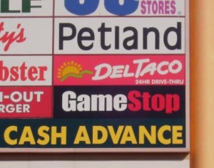
A good sign designer in Las Vegas will allow your business to standout from the clutter when you are competing for sign face ad space on a crowded pylon sign like this photo depicts
Most Cities are like this but not Las Vegas.
Just like Times Square, it’s like a magically place where signage becomes awe striking and amazing to look at and enjoy.
The point is, most local Las Vegas sign shops have in-house sign design teams or staff that comprise some of the best sign designers in the country.
So what does a local Las Vegas Sign Shop know about sign design?
Ole Larry here may share common sign shop design ideas and secretes.
Some sign design ideas are:
- Make good use of color
- Did you know red and yellow signs attract most attention?
- Keep the design simple and easy to read
- Use block text when ever possible
- Use a darker color back ground with white text for easy to read
- Tie in property and development theme colors
- Be different and be bold
- Incorporate key-lines to separate colors from contrasting
- Make sure your sign is always well lit and maintained at night
- Give the customer the design they want then add in your own ideas
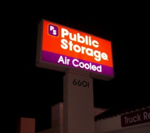
Notice how the use of bright colors and simple designed text allow this well known brand to shine at night
Many big Corporations utilize marketing agencies to brand their image.
Some Companies spend a good chunk of change on branding.
But many local sign companies have lots of experience with what works, whats hot, what attracts and what looks good.
Were not going to show case the amazing Las Vegas Strip signs here.
Let’s take a look at some sign designs that will help most businesses when they are looking for a nice clean sign design.
Take a look at some of the photos on this release.
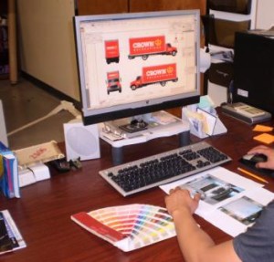
The photo in the upper left shows a sign shop designer working to creating clean and easy to read designs using sign design software.
Notice how the brand name is big and bold. See how the simple use of orange background color and bold text make that image stand out?
Now the second photo is a different story.
The second photo down depicts a crowded and cluttered commercial center pylon sign face. Most business get to place their name on the main pylon sign when they lease commercial or retail space but normally the large big area of the pylon sign is reserved for the ‘ anchor ‘. An anchor is the tenant like a big box retailer or whom ever is taking up a good chuck of space.
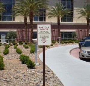
This No Smoking sign was designed to tie with the Hospital theme colors while adding a nice finished aluminum post for a professional clean look
So how do you stand out if you have a small space to fill on a cluttered pylon sign? Simple.
Make use of reverse like the ‘ Game Stop ‘ logo name with a black background or the ‘ Check Cashing Cash Advance ‘ Store name. Do you see how those names tend to pop and stand out from the clutter?
By using a reverse (a back ground color that is much darker in color and has lighter text is called a reverse) your name or brand will stand out verses everyone using white back ground with one color text.
Take a look at the Storage pylon. The next photo down. Even though this sign face is not competing with clutter this sign design makes use of a ‘ reverse ‘. Go ahead and look. Do you see the reverse in use?
If you guessed ” it’s the part that says Air Cooled ” then you are starting to see how a reverse will pop and make your sign easier to read. Take another look at that photo. You see how that simple sign design trick makes that sign face stand out?
But take notice here, that Storage sign is also well lit. If a few neon tubes or LED’s were burned out then that wouldn’t look so good now would it? Thus, sign lighting is important to keep an eye on.
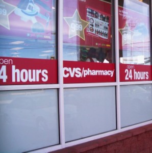
This simple red background with easy to read white block text is a great design because it attracts the eye and it is easy to read
But don’t sweat it, a good sign shop designer will design your sign using long lasting low cost LED lighting.
Another sign design idea is to do your best to tie in the property theme and colors when designing a sign. See the next photo down? The one one the right?
Yes it’s a simple No Smoking sign for a Hospital but notice how the post is powder coated brown aluminum square tubing not those unsightly cheap green sign post with holes all the way down. This sign was finished to hue into the theme colors of the Hospital.
The face may look white, but it’s really a nice relaxing cream color which also hues in with Hospital building color scheme. This adds the finishing touch a sign provides for this development.
A sign design that makes good use of theme colors provides an essence of professionalism.
Which bring us to the end of this months useful news release.
Next time you want to know what a local Las Vegas Sign Shop knows about sign design, you now know they know a lot.
Yes, some of this information here is pretty straight forward but it gets a point across. Good sign design will make a big difference.
If your in Las Vegas and you want to know what this sign shop may design for you, then contact Signs West Outdoor today. Signs West Outdoor of Las Vegas will add the finishing touch so your sign serves it’s maximum purpose.
Until next Month, may you stand out in a crowd and attract attention with a properly designed sign today.

