Did you know almost all new developments that go out to bid will ask for “alternatives”.
What’s an alternative or option?
An alternative is a substitute for a sign-type that is being specified by the builder.
And, the reason for having substitutes is…
They can save the builder money, without sacrificing quality or visual appeal.
(Hint: You can apply this, “ask for alternatives”, too. On all types of sign request you may have).
For example…
One new office complex builder wanted to utilize vacuum formed fiberglass signage for their exterior property directional and logo ID signage.
This is what was being “called out” on the plans and specs.
Plans and specs are merely approved architectural blue-prints for the buildings complete design.
These include everything from the parking lot plans, to the signage, to the foundation depth, and all that is needed to build the complex, to code.
However, the specs in this example, stated “alternatives okay”.
Meaning, if you have a better or different idea, then please include those on your quote.
Point is, custom molded fiberglass signage, which is 6 to 8 tall is expensive.
Plus, the vacuum formed signs needed to be secured to custom built internal aluminum frame-structures.
And, if you consider the fact that fiberglass tends to expand and contract with temperature changes from winter to summer…
You could see that a foreseeable risk existed. The costly fiberglass could actually crack.
Why? Because, the aluminum internal structure isn’t going to expand and contract at the same rate of fiberglass.
And, if the fiberglass is attached to a frame and it starts to expand in the high-desert-heat, well, you get the picture.
Somethings gotta give.
Long story short.
The “alternative” was to provide similar, professional looking, exterior property signs… and substitute the vacuum form fiberglass with custom post-panel aluminum signs.
Why? The aluminum exterior of the property signs will attached to the aluminum frames… and, both will expanded and contracted at the same rate (slightly) during swings in temperature.
Plus, a routed-out aluminum sign face logo and text, looks high-end and professional.
Bottom line, this alternative was accepted by the builder (General Contractor) and it saved the owner over 70k.
So, what does this story mean for you?
Always ask for alternatives, on every type of sign you’re looking for.
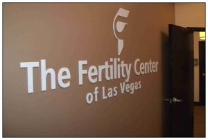
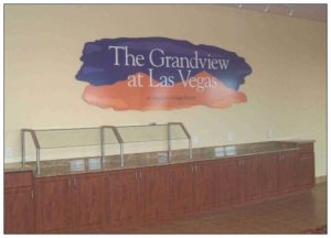
Even if they are simple ‘Impact Graphics’ like in the photo’s on this release.
An ‘Impact Graphic’ is a term used to describe a Companies name and logo you’ll see on an interior wall when you enter a business.
They’re usually installed on the wall behind the receptionist desk or in a (foyer) lobby area.
As in these example photo’s shown above, you can see two types of impact graphics.
One is a solid section, and the other is individually CNC routed letters and a logo.
Both impact graphics let you know you’re in the right place.
And, they both identify the name of the business.
However, did you know that there are so many “alternatives” to making an impact graphic sign that it would take up an additional page here?
Just to list them all?
Point is, sure, one option could be routed-out from expensive brass or less expansive gator foam.
One maybe laminated with a metal finish and the other with a simple color coat.
Therefore, no mater what type of sign your looking for, always ask for alternatives.
It’s good to have a few choices, wouldn’t you agree?
If you’re looking for signage and want a few extra ideas, then contact Signs West Las Vegas today.
There is usually a substitute, for every sign type, you can imagine.
Until next Month, may your signs make a visual impact today.


