One may ask “why do trashy” looking signs when you have the option to order professional appealing onsite property informational signage?
Have you ever thought about the visual appeal which your onsite property signs may be projecting into the minds of your prospective tenants?
And how this maybe effecting your traffic numbers?
Well, let’s take a gander, shall we…
And to make this easy, let’s pretend you’re in the prospective tenants shoes.
… As the prospective tenant, you’re driving around the Las Vegas valley, in search of a dwelling to lease.
You’ve already picked out an ideal part of town.
A section of the Las Vegas valley which will be close to shopping, and schools, and parks, and all of it…
You’ve narrow down your search.
So you begin criss-crossing the roadways within your ideal area.
As you do, you spot quite a few multi-family locations in the area.
One location has a beautiful view of the Mountains to the West.
Another offers a breathtaking view of the Las Vegas Strip at night.
One is situated across the street from a park.
Another is a block away from a school.
The trade offs seem equal.
You’re excited.
Yet, as you approach the community with a park across the street, you notice the property is loaded with trashy looking onsite signs.
The communities main ID signs are cockeyed.
The building ranges, and apartment ID signs, are all mismatched colors.
Some informational signs have red lettering on white back grounds which is creating somewhat of an eye-sore, because the buildings in the community are painted with tones of brown.
While some signs, like the apartment number unit ID signs have a blue background with white numbers.
Nothing hues. Nothing matches. Nothing highlights the brown theme buildings.
To you, these onsite signs look like a hodgepodge of grotesque grobble.
So you think to yourself “I’ll go down the street to the other community with the Mountain view.”
You whip your car around and head down the street.
Then suddenly, you can’t help but notice, the property with the Mountain views has you feeling all fuzzy inside.
Why?
Well, as you pull up you see the community has two and three story tall buildings.
The buildings are painted in a lighter shade of tan and have accentuating terracotta roof tiles.
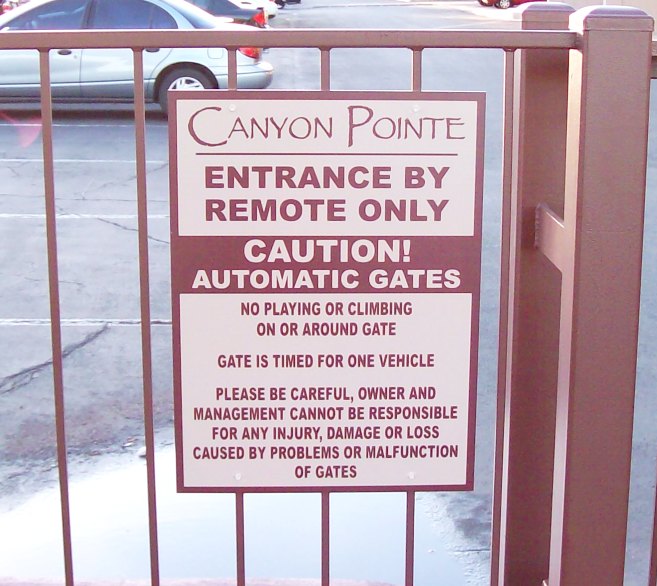
The entry way, building ID, leasing office, future resident parking, and onsite informational signs and signage are all color coated inline with the community theme colors.
Oh so pleasing to eye.
(See attached photo above)
Plus, all the signs look professional and each one highlights the overall communities appeal.
So you roll up to a future resident parking sign which welcomes you.
You exit your car and waltz in to view their floor plan displays and availability.
You’re feeling like you hit the jackpot… They have some open units on the top floor with an amazing view of red rocks and the Mountains to the West.
At the same time you notice the cost are in line with your budget -so you sign a lease.
And just like that, you found your ideal location to lease.
Now, imagine if the other multi-family community, which was a few blocks away by the park didn’t scare you away with their trashy looking signs?
Would you have at least viewed their floor plans?
Viewed some available units?
One may want to think so. Right?
Thus the moral of this story is…
You may have a wonderful community.
A great place to live.
All the amenity’s which one may so desire.
But your trashy looking mismatched signs are scaring prospects away.
The irony being, most builders or developers don’t even see how onsite signs and signage may accentuate their property.
And how well designed informational onsite signs will add the finishing touches to their communities visual appeal.
What’s worse is some sign companies don’t even have the gift to create appealing finishing touches.
It’s why you see trashy signs.
However Signs West Outdoor has the gift.
So, if you’re planning a community retro fit, update-upgrade, or even breaking ground on your new multi-family developed, don’t you owe it to your prospects to dazzle their eyes will subtly appealing onsite signage?
To bring them to that fuzzy feeling of happiness inside as they roll up into your property?
A place which they may soon be calling home!
And if so, and you want help with your multi-family property sign package design and production, then why not call on Signs West Outdoor today.
Gain the finishing touch of appeal which will accentuate your properties presentation in the mind of your prospects.
Call Signs West Outdoor now at (702) 879-8250.
After all, don’t you deserve to have onsite signs and informational signage like you see in the photo on this release.
Because if a pictures worth a thousand words, then the photo above above speaks for itself.
Sure beats trashy, wouldn’t you agree?
So call Signs West Outdoor and get the finishing touch of professional appeal today.
And stop scaring prospects away.
Until next month…
May you create some fun fuzzy feelings in the hearts of your prospects visiting your property too.

