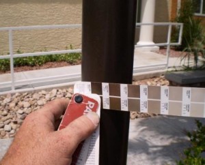
Want to know why Pantone color matching signs adds to a maximum visual appeal?
This is Larry with this months release on how to add maximum appeal to your signs or signage.
Did you know by simply color matching new or existing community theme colors to all onsite and offsite signage that it will maximize the appeal of the community or development?
Before digging in here. Let’s define the word “maximum appeal “.
Maximum appeal means the visual appeal of the overall development, building or community.
As an analogy. Imagine this appeal being no different then baring witness to the autumn leaf changes as mother nature prepares for winter.
Isn’t it breathtaking to just view all the beautiful hues and colors that seem to blend in effortlessly in with nature to create a sensational visual of peace and harmony in a persons mind, body and soul?
You probably have that visual right now, don’t you?
Who doesn’t love to enjoy the scenic beauty of fall year round?
This is similar to creating the visual appeal of a community, business or development. Right?
Imagine driving up to a resort with towering palm trees lining the road where all directional signage colors and hues create such a similar visual appeal to the senses.
Imagine pulling into a new community and feeling a sense of calm and comfort.
Imagine if a local Las Vegas Sign Company was able to understand the delicate and proper use of color hues and blends as they have on human senses?
If one thinks about it, the more colors hue the more comforting they become.
It’s as if everything fits verses a hodge podge of mismatched distractions.
As you see from some of these photo’s on this release you begin to understand this autumn analogy setting.
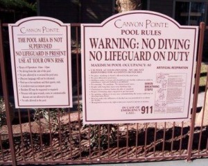
Take a look at those Pantone color matched pool rules signs with a delicate custom cut out shape above. You see how that picturesque visual appeal begins to form that subtle balance of belonging?
Imagine if that pool rules signs was a typical off the shelf white and black square boring sign? You see how that might add shock to the setting? Meaning those colors do not work, right?

Using the right hues and colors allows these building range and unit number signs to accentuate the visual appeal of this multi-family community
Similar with the color matched community number and range signs photo on the left here.
Do you see how that slight blend of golden yellow trim on the sign ties it into the soul of the community?
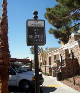
Or even the handicap and no parking sign photo below.
See how the custom curves, color reverses and hues ties it into the architectural essence of the development down to matching trash receptacles?
The main point is, no mater how subtle the hue or soulful the color blends of onsite architectural and development signs they actually do play a key role in the essence of appeal of the building or community itself.
When a new customer strolls by, drives in are pays a visit. These little nuances of precise detail to color most likely create a positive first impression which really does flow into a feeling of peace and harmony of the beholder.
The properties essence has a soulful color of autumn for all to enjoy.
Yes, Larry here may be going a bit to deep but by creating the picture in ones mind of maximum appeal, but it may better help one understand the importance which proper use of color has for all signs in all types of settings.
Before ending this months news release. The purpose of why Pantone color matching on signs leads to maximum visual appeal came to myself this morning when photos of friends in Denver were on the kitchen counter.
When sharing with family, did notice the picture from Colfax Avenue and there it was again, all those white back ground with black lettering signs. Yes, right there in the photo’s.
The same signs myself use to see back in the early 80’s that made me cringe. No branding, no autumn, no good use of color?
It bother me then and still bothers me today.
It’s something I was forced to accept. That some people just do not understand how important colors are.
Sure, if your not in the sign business you may not see 23 black text on a white back ground business signs over a 3 blocks stretch but it’s there and bothers me. Not to the point where I’m awakened in a cold sweat every night, but it’s haunting to say the least.
Imagine if just one of those businesses had used a red back ground with a playful type style and a touch of brand on their sign?
Wow, huh, yea, hello, you got that right? Didn’t you?
It would stand out like a sore thumb among all that blandness.
So here me sits, sharing this months release about matching sign colors and hues to Pantone call outs.
Using the proper color blend and hues when it comes to signage that adds a finish touch to all buildings, environments and communities.
This is what you want to achieve. You want that maximum visual appeal and you want to create a positive first impression.
Until next month, if you looking for the essence of autumn analogy in your signage it’s important to talk to a sign expert that knows how to paint that scene with signs in color.
If you want expert advice on how to use Pantone color matching on signs and signage that adds to maximum visual appeal then you may always contact SignsWestOutdoor.com.
Ask for Larry. I’d love to create that masterpiece for you. So So subtle but yet so appealing.
Enjoy.


