
Here’s an example of why uncommon sense is the ideal answer, sometimes, when installing signs.
Easy to read Garage Port ID number’s
In the Signage, and Huge Banner, and Graphic’s business, we follow a set of common-sense rules.
One of the oldest ‘common sense’ rules around, relates to how your message or a visual is being designed, for easy readability.
The sign design rule is…
Make sure that the bottom margin (space between base of your sign and the last line of text or visual) is bigger than the top margin (space between top of your sign and the top of the first line of copy).
This subtle padding of extra space, on the bottom of your sign message or visual, is not noticeable.
But, this extra space, on the bottom of your layout, is vital.
Because, it instantly make’s your message “easier on the viewer’s eye’s”.
And, a bigger bottom margin, allows for a ‘quick visual understanding’, of what your intended message is presenting.
Even though, you may not have noticed this extra spacing, until now, as we’ve pointed out.
The extra bottom spacing is required, to balance your over-all visual messaging and imagery, on your sign or large graphic, for ease of view-ability.
Most of you probably didn’t even know this ‘margin rule’ is in use.
However, it’s being utilized on almost every type of visual messaging you view.
From signage to all type’s of indoor and out-door advertising.
Even on all kinds of print material.
The subtle margin-spacing rule is in effect, every day.
Many believe the text or message, being presented, is actually centered on the sign type?
Where all the space, around the edges, is equal?
And they’re not.
Take a closer look (now that you’re aware of this little design and layout secret), next time you spot a sign.
See the bigger spacing on the bottom?
If the messaging and text-copy were to be centered all around, on all sides, it would look cock-eyed, and optically appear, all funky-looking.
Yes, your eye’s would immediately notice, then think, something’s not right with this sign or graphic?
So, go ahead, next time you see a sign, display, large banner or graphic print…
Take a gander and see if you can spot the extra space, which is there, to make the sign easy to read?
However, sometimes this common sense rule of design or install needs to be tossed aside.
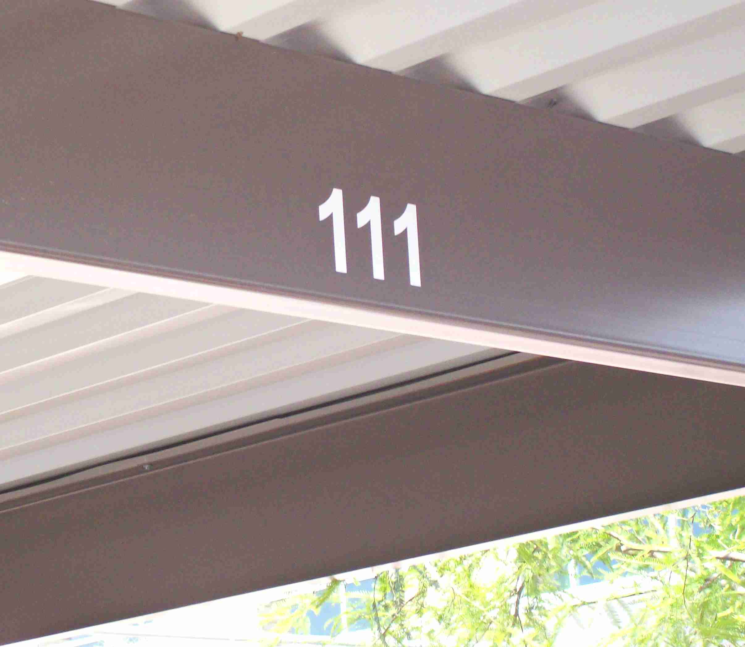
Why? Because, as depicted in the above photo, you will notice the garage port ID number’s are installed close to the base of the over-hang.
Yes, it would look much more visually appealing, if the parking ID-number’s were installed higher up.
And with a bigger bottom margin than the top.
But, the roof of the garage port structure would be blocking the intended, and easy to understand, message.
If placed higher up, the is the parking stall number would be harder to see. If not blocked, almost entirely.
This is why, uncommon sense prevails here.
Sometimes obstacles get in the way and ‘block’ or ‘obstruct’ the easy readability of the sign message being presented.
The garage port roof sticks out and blocks a good portion of the car-port’s ID number, and what would be, the easy readable visual area.
Therefore, the assigned parking spot number’s are placed near the bottom of under-hang area, to quickly ID the parking space.
Now, we’re not saying the common sense rule’s need to be broken.
We’re just pointing out, that sometimes you gotta use uncommon sense, to make it easy and clear for someone to quickly spot their assigned or reserved parking spot. As in the example, being presented here.
And to consider designing, or installing, a large graphic or sign using uncommon sense, especially, when you know, an obstruction is in the way of the visual messaging.
And blocking the line-of-site.
So there you have it. A non-noticeable, and everyday sign, and large graphic, rule exposed.
If you want help, getting your message out, with clear and easy to read visual’s, then contact us now at (702) 879-8250.
We’re here to help, because, sometimes it may call for a little uncommon sense.
Tell ’em Larry sent yah.
Until next Month.
Watch for potential obstacles which can block your sign’s readability… and catch it ahead of time, before it’s to late.
Enjoy.
